by admin | Aug 6, 2015 | Blog
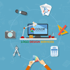
Experienced designers here at Colorgraphicz, who create logos for living have gotten pretty good at the process. Although we hate to put too structured an outline for such a creative endeavor, hey, as they say, deadlines require scaffolding and best practices make any...
by admin | Jul 31, 2015 | Blog
IT/Tech: Sleek, upbeat and current. That’s the image for most tech companies. Having to show they are on the cutting edge, these logos tend to evolve a bit more quickly than other logos. Logos that look good on a small square mobile app on an iPhone is the look many...
by admin | Jul 31, 2015 | Blog
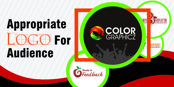
It may seem so basic to say that a logo needs to be appropriate for the intended audience, but you may be surprised how many businesses have a logo that just doesn’t fit what they are trying to do. Most, however, tend to fit with their industry and service. A closer...
by admin | Jul 31, 2015 | Blog
Simple: a logo needs to be able to be easily described. If you have a hard time describing what it looks like, then there is a good chance it’s too complicated. Memorable: With an internet full of millions of logos, what can you do to make yours memorable? We are...
by admin | Jul 31, 2015 | Blog
A logo is a flag, a signature, an escutcheon, a street sign. A logo does not sell (directly), it identifies. A logo is rarely a description of a business. A logo derives meaning from the quality of the thing it symbolizes, not the other way around. A logo is less...

Recent Comments